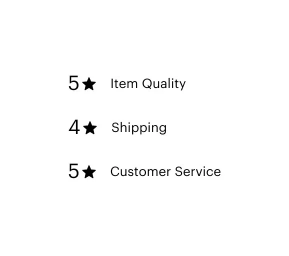
Etsy Subratings
TEST TEST TEST TEST
We simplified the nav bar design for signed-out users, enhancing functionality for frequently used features while minimizing distractions from page content, allowing better product evaluation and discovery.
+0.77% conversion rate lift
+0.53% increase in add to cart


Hypothesis
We believe that displaying detailed information about the quality of an item will build user trust and increase confidence in making a purchase decision. We will know this is true when we see an increase in conversion rate.
Background
Reviews are critical for users to assess an item’s fit for their shopping need, assess quality, and hear from other users about their perception of an item. I ran an experiment to try to optimize performance on mweb, which had an aggregated star rating but hid full user reviews behind a content toggle on load. The result tanked conversion so hard that we stopped the experiment early.
Goal
Create a system to collect subratings on the web, creating consistent cross-platform reviews data collection. Use the subratings data from submitted reviews to display structured UGC data about items on the listing page.
Running with the learnings from my failed experiment, I was curious to see if the inverse would be true—Does adding more detailed information result in increased conversion? To test this, the team would have to not only prove value on the reviews display side (on the listing page) but we would also need to ensure that we didn’t lower the number of overall review submissions by adding additional steps to the submission flow.
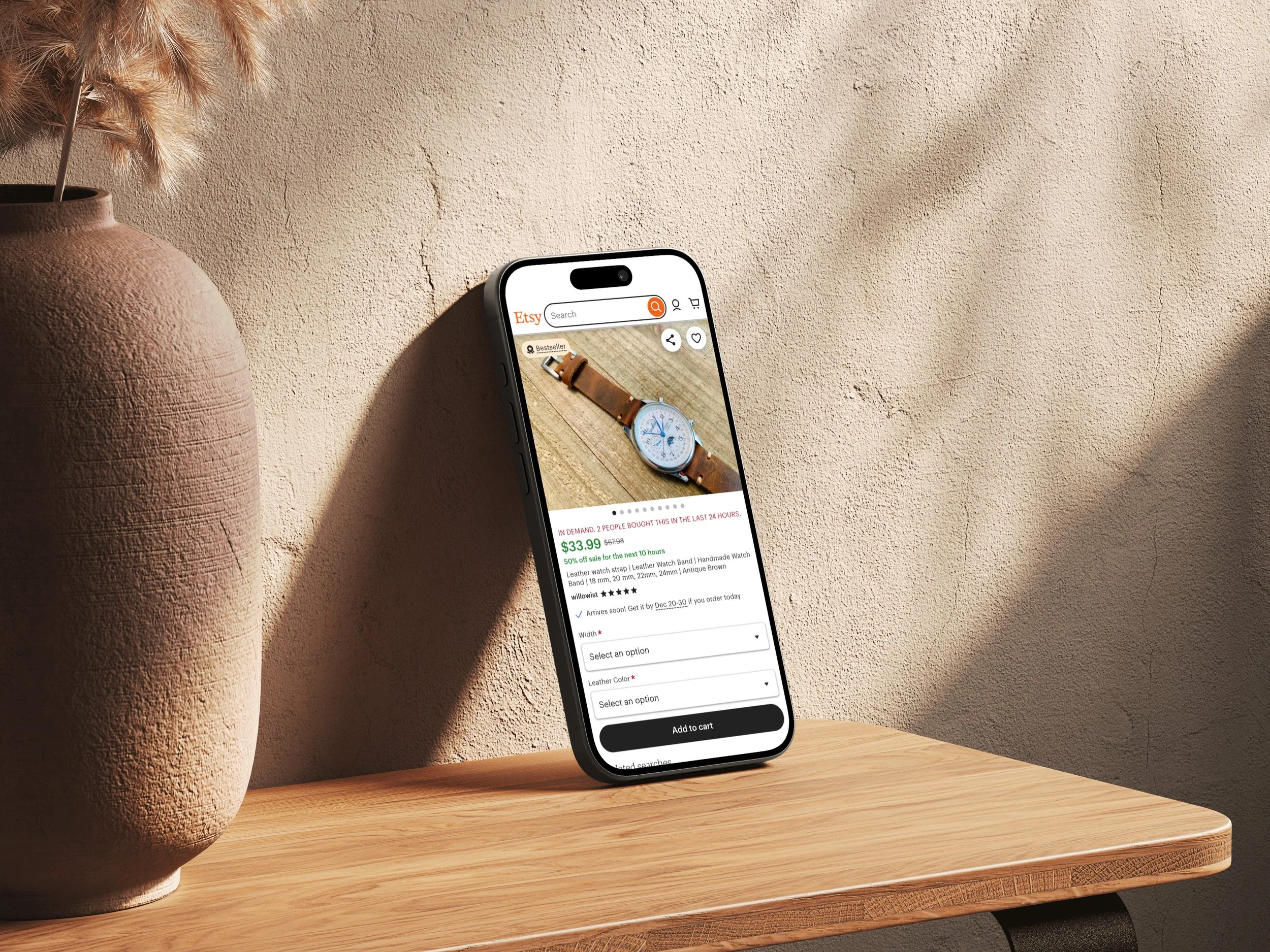
Prior to launching our experiment, subratings were being collected only on the Etsy app but weren’t displayed anywhere. This meant that we could use the existing subratings to quickly probe into the value on the display side, without having to modify any submission flows. This was a key point in our strategy to quickly gain directional signal on the value of subratings to end users.
Process
Foundational learnings from the MVP
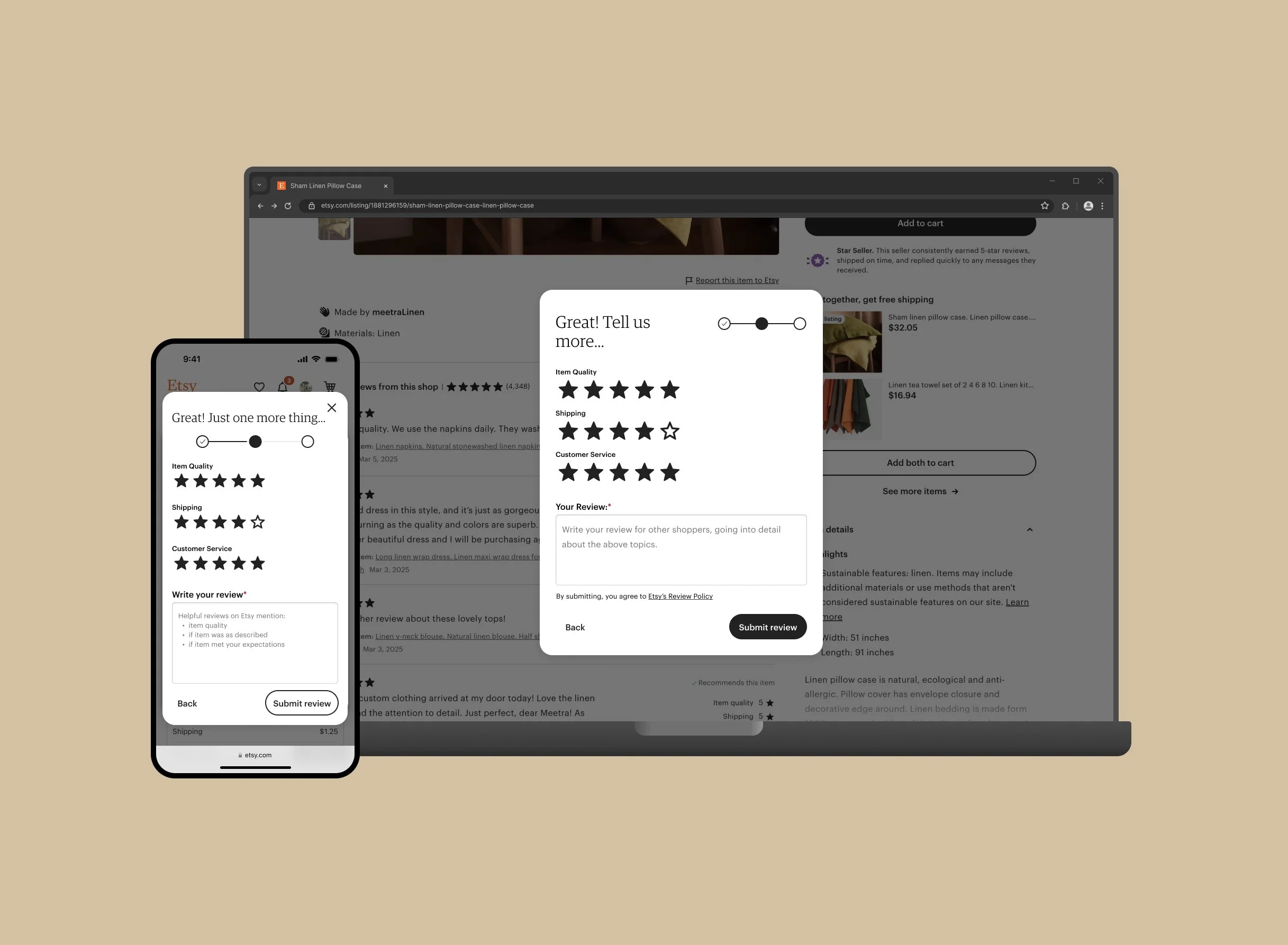
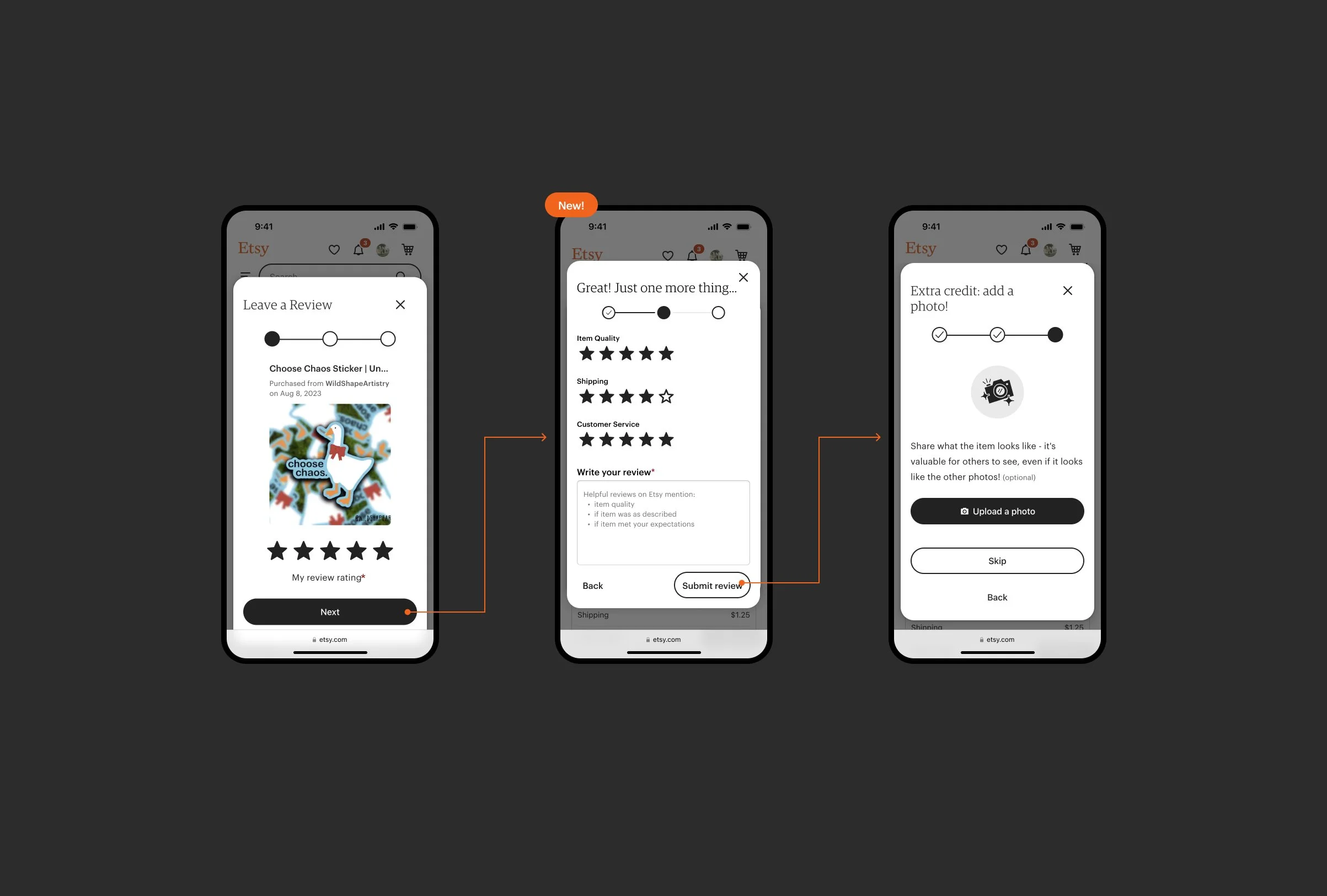
The subrating track of work would need to be split up into two experiments. The first needed to prove the value of displaying subratings on the listing page. The second needed to prove that we could add an additional step to the review submission flow without negatively impacting submission rate.
For the subratings on the listing page, we wanted to get something out fast to see if the subratings display would be worth the time investment. I regretted this decision to prioritize speed-to-learning because I don’t think that the UI we shipped was actually that good. We jokingly called it the “bar crawl” treatment because 95% of users left a 5 star rating which looked like three stacked progress bars with no segmentation, creating a bunch of seemingly random lines repeated down the listing page. This treatment also didn’t perform well on mweb likely due to the amount of vertical space it consumed.
We launched on desktop after seeing positive engagement and purchasing metrics resulting in +$9.7M GMS (+0.50% CR lift, +0.29% ATC, +0.54 Checkout starts).
